Design Thinking: Testing Report
FindMyMuse
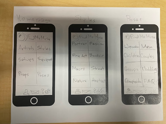
An app FindMyMuse can help photographers copy famous photographers' styles and help them to develop their own. It can provide all the information about the shoot, from equipment such as cameras, lenses, lighting, and softboxes to props, makeup, and model posing recommendations.
The target audience for this app is photography enthusiasts who want to learn from the best and improve their skills. This app can be handy for those just starting in photography and wanting to learn from the best in the industry without spending years going to school and investing money in a degree in photography. With this app, photographers can learn from the best in the industry, practice, and create stunning images that would help them develop their style and increase the price of their photoshoot.
Lo-Fi, Composite, & Prototype


Design Thinking Process Summaries
Empathize:
My challenge during this stage was that there were many similar apps for photographers, but none of them combined all the features I added to my app. It was easy to get quantitative data and see the number of downloads, but it took a lot of work to gather qualitative data regarding what people think about certain features of the apps because it is very uncommon to leave extensive reviews for this type of app.
Define:
The primary challenge was the need for more data. With abundant ideas and features for the app, I faced the challenge of organizing them. Utilizing the cluster notes method effectively structured my thoughts, and I compiled a list of issues users commonly face with other photography apps.
Ideate:
I focused on generating simple solutions to address the identified issues during the ideation stage. Considering layout adjustments and curating a list of potential features were crucial tasks. The main challenge was deciding which features to keep and which to eliminate.
Prototype:
My lack of prior experience in app design was a significant challenge. Understanding the technical aspects of creation became a learning curve. Additionally, defining the overall theme and establishing consistent design patterns for the app required extra time and effort.
Test:
In the testing stage, my biggest challenge was the question of whether users would comprehend the app's purpose and successfully navigate from the homepage to a photographer's equipment. Ensuring users could complete assigned tasks became a focal point, introducing unpredictability in the testing phase.
Interview Questions
How would you describe your interaction with the app?
What navigation and interaction challenges have you had when using the app?
What features or design elements do you find most helpful in the app?
How do you feel about color, shape, and font choice?
Have you experienced difficulty understanding the app layout?
What buttons would you add/remove from the app?
Are interactive elements inside the app arranged in a way you find enjoyable?
Can some apps' layout features negatively impact the overall user experience?
What features/buttons would you add to the app?
Answers
Participant #1

How would you describe your interaction with the app?
My interaction with the app was straightforward and easy to follow. However, I found that the information was a bit cluttered and disorganized on the home screen.
What navigation and interaction challenges have you had when using the app?
I encountered challenges with navigation as there were many pages to explore. I had to press the back button to navigate, and having a seamless integration between pages would make the experience easier.
What features or design elements do you find most helpful in the app?
I appreciated the layout on the home screen and found the shapes and font choice suitable for a photography app. However, adding some color for visual appeal in this digital age would be beneficial.
How do you feel about color, shape, and font choice?
The shapes were great, and the font choice was fitting for a photography app. The color, reminiscent of black and white photography, could benefit from some brightness to draw attention to important elements.
Have you experienced difficulty understanding the app layout?
While the beginning was laid out cleanly, I faced difficulty towards the end with numerous touchpoints. As a user, I found myself unsure of where to go next.
What buttons would you add/remove from the app?
I would suggest adding forward and back navigational buttons to the bottom for easy page changes without clicking on additional prompts.
Participant #2

How would you describe your interaction with the app?
I liked the app, but I felt there could have been clearer navigation. Clicking through buttons to move around took a while, and I think placing words strategically on the screen could enhance user instinct.
What navigation and interaction challenges have you had when using the app?
While exploring a photographer's equipment, I got stuck on that page and had difficulty navigating back to view other photographers. Adding a back arrow could make moving between pages easier.
What features or design elements do you find most helpful in the app?
The question buttons symbolizing support and providing tooltips for important information were helpful. This feature is crucial for users to understand and navigate certain pages effectively.
How do you feel about color, shape, and font choice?
I felt there was an excess of neutral colors. Adding a few more colors could make the app more engaging, entertaining, and enhance the overall user experience.
Have you experienced difficulty understanding the app layout?
The app layout was basic, but making some changes for a cleaner and more user-friendly interface could improve navigation and overall usability.
What buttons would you add/remove from the app?
I would add back and forward buttons, as previously mentioned. Removing some unnecessary back buttons and incorporating links to photographers could enhance the app's features.
Summary of "next steps" - what would you do to continue testing? Tell me process stage, method, and reasoning
To continue testing the app, my next step would be to go back to the prototype phase and improve the app interface. I would consider all the data I gathered during the interviews and incorporate new features into the app. Also, I would use the survey method so the data I collect would be more specific and include more people. It would make more sense to gather feedback directly from the intended target users so their evaluation of how well the app meets their needs and expectations would make more sense. The usability testing should focus on specific tasks, such as navigating from the homepage to a photographer's equipment, to assess user comprehension and interaction. With a large group of people, using the focus group method would also help.
Conclusion - for you, what was the most important and/or engaging stage of the design process? What is your idea for your capstone? How do you see any of the UX methods (be specific - pick one or two) working for your project?
The engaging stage of app development was prototyping because it allowed for creative exploration and experimentation. During the prototyping stage, I faced the challenge of transforming many ideas into one cohesive design. Also, creating low-fidelity prototypes was particularly time-consuming as it required attention to detail while keeping the design at a basic level.
The most important stage of the app design process was testing because it gave me a critical evaluation of real users who interacted with the app. Their responses allowed me to gather valuable feedback on the app's usability, functionality, and overall user experience. By observing how they interacted with the app, I could identify major issues, understand preferences, and decide how app design could be improved.
I would also use A/B testing and focus group methods for this project because they would give me both quantitative metrics and qualitative feedback. The results of these methods would help me optimize for performance and address user preferences.
For my capstone project, I decided to write a thesis on using artificial intelligence tools to increase search engine optimization strategy. I am sure the methods and techniques I learned during this class will help me conduct proper research and data analysis.


Comments
Post a Comment